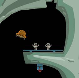
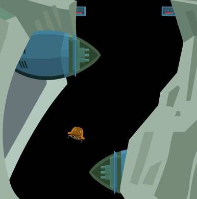
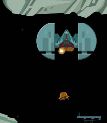
A taxi drivers lot isn't a happy one on the whole. Constant traffic jams, rude customers, your busiest time is when you want to be out partying as well, early morning airport runs, drunks with smelly kebabs ( Ahem ).
As it happens the Yang Transport Corporation is looking for drivers. Well, pilots. Simple enough job, just pick up a couple of miners who have been out and gone and got lost. Miners eh ? Can't trust them not to go wandering off in space caverns for a minute.
Well YTC, take down that job advert, cause you've got your man right here.
"Been busy tonight mate?"
What we have here is a Moon lander / Thrust style game. Your taxi is from the asteroids class of handling, rotating and thrusting it's way through large caverns with the usual tricky inertia and gravity. For the very old, or retro inclined of you, think Airwolf meets asteroids.
Like asteroids you have some fire power. Unlike asteroids, it's a one shot at a time deal. This isn't as bad as it sounds, the weapon is just a means to an end, this game isn't a shoot em up. Your weapon is there to broaden the gameplay, and is not the source of the gameplay.

Cab for Dave ?
The object is to fly around the huge caverns, avoiding collisions with the landscape and the various defense systems collecting the missing miners ( By, well, landing on them ).
Oh dear, this is were it all goes a bit down hill. I've been putting it off, but I can't any longer. Can I just say firstly I admire anyone who writes any sort of game ? What a huge achievement it is to have a game go gold ? That's my lame attempt to suck up before I release the following venom...
"So what time do you finish tonight mate?"
Presentation wise, it starts well. A nice strong theme, it draws you straight into sporkle's world. And then... the hi-score list for example using a standard Flash component. Small point ? Possibly, but I want to sucked into their world, into their vision, so why not reskin it ? Another example, you can set the quality in-game ( Thankfully ! But I'm getting ahead of myself ), but the option is on-screen all the time you're playing. Why ? Same with the abort button. Why ? When you click on the quality button a seperate set of buttons appear, for your low / high etc. But the game doesn't pause whilst you're dropping the quality down.
Sorry, am I nit picking ? Possibly. Perhaps I expect tighter presentation. Yeah, gameplay is king and everything else is just icing, but I don't want a great cake smeared in dog poo flavoured icing. That's metaphorically speaking btw. It's so nearly great, but comes up feeling rushed.

Twisty and turny baby
My PC is a 800mhz Duron, and it's got 128 meg under the hood. Pretty lame by most standards. But I expect a web based game to be playable on that set-up. If I can play Max Payne on it, I should be able to play a Flash game on it. Any Flash game. Even with low quality set, this game handles like a pig. A pig with wooden legs. It feels un-responsive and it's just painful to be killed by a moving baddie which starts off quite a way from you but which you can't outrun cause your taxi is as slow as a real life taxi ( If you don't believe me, play this game then jump in a black cab around London ).
Speaking of the baddies, their bullets are a pixel in size. Nice and bright and of course show up well on a black background, but far too small in the heat of the moment.

Look out for those bullets ! Those bullets... those ones. Come closer. You see, those bullets. Oh, forget it.
Graphically it's really rather good. I love the old retro feel to the actual cab, and by making the game art based and drawn in vectors it has a very nice look to it all. Sound on the other hand is basic at best.
"Ever had anyone famous in the back then mate?"
I've been pretty harsh with this review and I really didn't want to be. It has sparks of real greatness. This could have been a fantastic game. Instead it feels deadline rushed, and really suffers because of it.
Why have such a large scrolling window ? Flash sucks at moving lots of data around, so why design it that way ? Looks great... until it moves. You can take the view point of games can't stand still and be tied to out dated systems, which is a very valid point. But in return for needing high specs. I in return expect something far more than this.
Sorry Sporkle. This could have been so much more, and it's a real shame it isn't.
Squize.


