 |
 |
 |
 |
 |
 |
 |
 |
 |
 |
 |
  |
 |
||||||||||||
 |
|
|
|
 |
  The Complete Guide to Isometric Pixel Art The Complete Guide to Isometric Pixel Art[ October 22, 2004 ] by Rhys Davies aka RhysD A long tutorial made of 7 chapters, covering all the aspects of isometric pixel art: drawing basic objects, colouring, lighting, texturing, drawing people, etc. |
||||||||||||||||||||||||||
Chapter 5 Drawing Isometric People When I came to write this chapter I nearly freaked out at how hard it will be for me to create a tutorial for making small isometric people. Then I realised that you are probably here reading this to find out. So I gave in to my urge to watch some TV and I started writing it. Isometric people are really the most difficult things to create in IPA. What I usually do may seem a tad odd but it works most of the time. First things first. I start by creating a small vertical isometric rectangle, about the size I want my person to be. I then cut a small portion off the top of it until I reach the neck line.
Figure 4.9 Next, I create a small oval shape around where I think the head should be placed. What you should have now is a rectangle with a head. Next are the torso and legs.
Figure 5.0 I first mark where the torso ends and the legs begin. Then I divide the bottom half of the rectangle into two even halves. These will be my legs. Then I go back up near my neck and round the shoulders off until they look about right (see the example images if you aren't too sure. So basically, all i'm actually doing at the moment is carving a person out of a block of virtual wood. I might also bring the legs in a bit, and the body so the person becomes skinnier.
Figure 5.1 Now I add my arms to the person. Two thin isometric rectangles down each side of the body usually works. Although, you can bend them around as I have done in my example below. Posing your people will be explained soon. Add some little hands to the ends of the arms and add some shoes for the feet. I have also touched up the legs to make them a bit straighter. I also made the head smaller and neater.
Figure 5.2 All thats left to do now is to add some hair, clothes and facial features. I usually start with the clothes first. They need to be slightly larger than the body and any bare skin should be distinguishable from the clothing. What I do is create an outline of the clothing 1 pixel out from the original body frame, then erase the inside line to clear things up. As you can see below, I have my original body frame, then the clothing being added and then the final product.
Figure 5.3 Next, add a small face and some hair. You don't really need to stick with the isometric guidelines when it comes to creating hair, as we all know hair has a mind of its own and can stick out wherever it wants.
Figure 5.4 Colouring is all that is left to do, as well as some minor shading to make the person look more 3D.
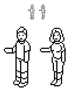
The Basic Outline & Scaling Below I have included the basic outline of both a female and male for you to study. Both have been enlarged so you can study how each pixel works with each other to create the person.
Figure 5.7 Scaling your people to fit your scene is very important. Otherwise you'll end up having the scene from the “50ft Woman”, instead of a childrens playground as you originally intended. Doors need to be high enough for the people, as if they were alive and could walk through them. Chairs need to be the right size for people to comfortably sit on and the actual people need to be somewhat realistic. You don't for example have a 5-year-old child towering over an NBA basketballer asking for an autograph. Poses Posing your people can be an interesting challenge. If you have a wooden manequein handy then your life will be a whole lot easier. If you don't have a wooden manequein, use a nearby friend or relative to pose how you want, study them and try to recreate it in your scene using your isometric person. A person running would have legs bent in the running fashion. All you really need to do is imagine yourself and how you would perform the pose or action. Making the character seem that they are performing the action by sometimes over-exaggerating their movement is the best way to get your point across on the virtual canvas. Colour & Outlines Posing your people can be an interesting challenge. If you have a wooden manequein handy then your life will be a whole lot easier. If you don't have a wooden manequein, use a nearby friend or relative to pose how you want, study them and try to recreate it in your scene using your isometric person. A person running would have legs bent in the running fashion. All you really need to do is imagine yourself and how you would perform the pose or action. Making the character seem that they are performing the action by sometimes over-exaggerating their movement is the best way to get your point across on the virtual canvas. Examples For Further Reference Below are some examples of both my own work and the work of the awesome team at Eboy.com. As you can see, their work is really well created and you will learn a lot from studying how they create their work and their people.
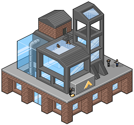
Figure 5.8 (copyright 2002 - Rhys Davies)
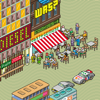
Figure 5.9 (copyright 2002 - Eboy) |
||||||||||||||||||||||||||

|
||||||||||||||||||||||||||
|


