 |
 |
 |
 |
 |
 |
 |
 |
 |
 |
 |
  |
 |
||||||||||||
 |
|
|
|
 |
  The Complete Guide to Isometric Pixel Art The Complete Guide to Isometric Pixel Art[ October 22, 2004 ] by Rhys Davies aka RhysD A long tutorial made of 7 chapters, covering all the aspects of isometric pixel art: drawing basic objects, colouring, lighting, texturing, drawing people, etc. |
||||||||||||||||||||||||||
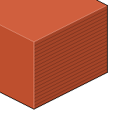
CHAPTER 4 Texturing Texturing your objects and buildings make your pieces more interesting and pleasing to look at. Going for the plain coloured look can be good if you are giving it that cartoonish look, but usually it's a tad boring to look at. A building is usually made of bricks, so why not give it a nice brick texture on its walls. This can be achieved by following this small tutorial below. Step 1. Draw evenly spaced horizontal (iso-horizontal) lines across the side of your wall, using a darker colour than the original wall colour.
Figure 3.6 Step 2. Once this is complete, go along drawing small vertical lines that jump each line as you move down. They also need to be evenly spaced as you move along.
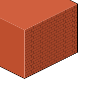
Figure 3.7 Step 3. Now repeat this process on the gaps that have no vertical lines, drawing each small vertical line in the middle of the 'brick' above. There you have it, the simple brick texture. Step 4. To make it more brick-like and nice to look at, we're also going to add highlights to every brick to make them stand out more. So, decide (or look) at where your lightsource is, and highlight the part of each brick that the sun will be directly hitting (with a lighter colour).
Figure 3.8 As you can see, texturing isn't all that hard, and once you get it down you'll never have another plain looking wall again. Now, we'll look at some other texturing examples. Grass Texturing grass is very different to texturing bricks. My method works alright, but you may want to deviate away from it if it isn't really your style, or it doesn't fit your overall feel. Here are the steps. Step 1. Grab your isometrical plane that you wish to texturise with grass.
Figure 3.9 Step 2. Apply random pixels of a darker green colour around the plane. Be as random as you can and only use single pixels.
Figure 4.0 Step 3. On top of each random dark pixel, place a pixel that is lighter than the original plain grass colour. So now you will have three colours, ranging from darkest (bottom of grass blade), to medium (base grass colour), and finally lightest (top of grass blade).
Figure 4.1 Step 4. On top of all this, to make it more detailed, apply pixels that are in the middle of your base grass colour and dark blade colour; randomly in between the blades of grass.
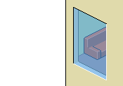
Figure 4.2 Step 5. Step back (zoom out) and admire. Next up is glass, it's not really a texture but you do have to apply some detail to it in order to make it appear both translucent and shiny. Glass Ok, this next part is what stumps most people trying to create nice looking buildings with cool windows. The easy (and recommended) way of creating glass for your buildings is to use Adobe Photoshop or similar. All you need to do is create a separate layer, fill the glass area with a light blue colour, and adjust the transparency of the glass layer (see below for example).
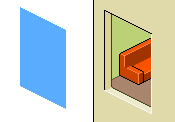
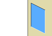
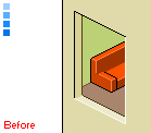
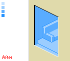
Creating your glass within MS Paint is a lot more difficult on the other hand. We are going to use a selection of different blue colours. If you have detailed the inside of the window with a room then all we need to do is go over the outlines of the furniture and objects inside the window frame with a darker blue colour. The rest of the window is then filled with a lighter blue colour, and a highlight can be added over the top. See the images below for the before and after shots. I have also added the blue pallete I used for the glass and highlights.
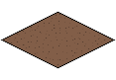
Dirt & More Drawing a dirt texture is somewhat similar to grass. Only this time we aren't using highlights at all. All you need to do is grab your base dirt colour, spinkle some random darker dirt colours around it and then another lot of random (lighter) dirt colours. An example can been seen below.
Figure 4.8 Other textures are created in similar ways. The best advice I can give you is to look at real-life textures, or search for images of textures using a search engine. Studying these photographs usually helps you decide what to draw and where your shading and highlights need to be. Detailing Your Work Detail is what grabs most people's attention. Simple miniscule things such as light fittings, glasses and plates in sinks, or drinks in a refridgerator can make a simple setting into a grand masterpiece. Pebbles on a path, insects in the garden, they all count towards a succesful piece of isometric pixel art. People love to study all the small details they can find, and if you include more of them, the more people will look at your picture for a much longer time. A plain cube can never be compared to a cube with a few trees growing out the top of it. So next time your creating a piece, remember to add all the details you can think of to make it an even better piece of art to look at. |
||||||||||||||||||||||||||

|
||||||||||||||||||||||||||
|

